Back
Back

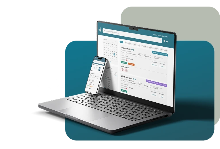
A platform that slowed down medical care
The waiting room management platform had complex flows and usability problems that made the daily work of doctors and technicians harder. Teams could not clearly see the real status of patients, which caused confusion and lost time throughout every shift.
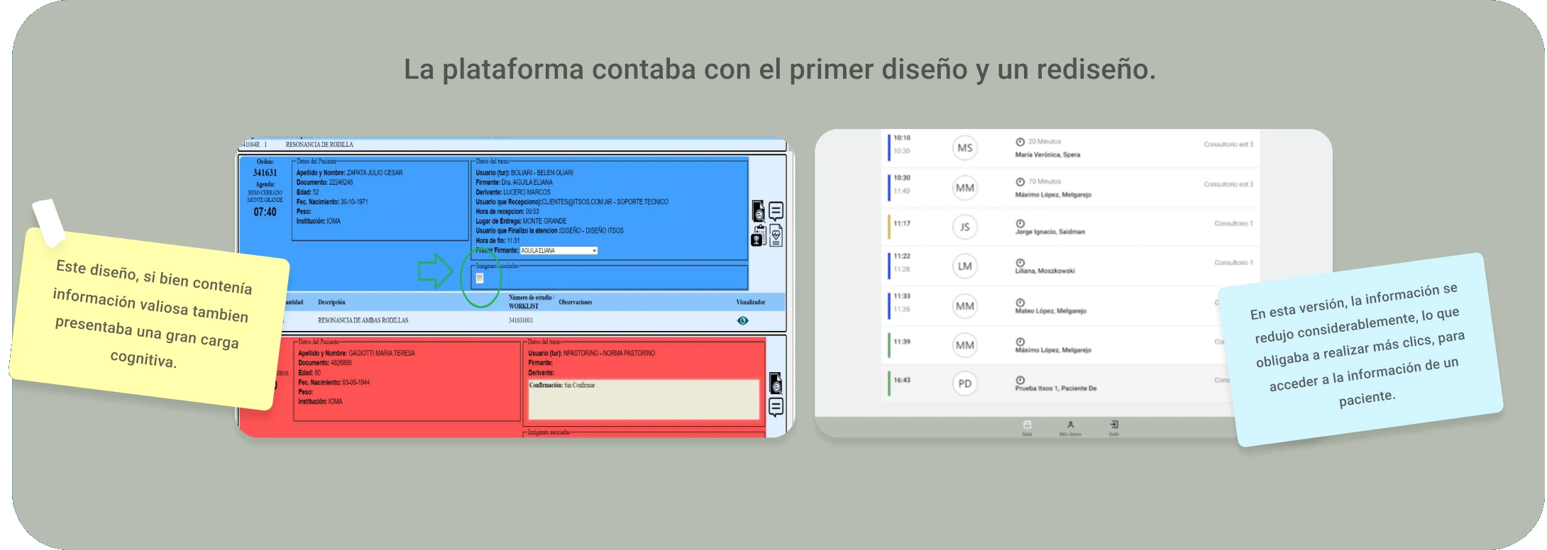
From a complex experience to more efficient care
Optimize waiting room management through a redesign focused on clarity and efficiency, providing real-time visibility of patients, differentiating care statuses and clearly communicating previous studies and those still to be done.
The central challenge was to redesign a single screen used by dentists, radiologists and clinical doctors — each with specific needs — without requiring the existing system to be re-adapted.
The aim was to strike a balance within a space shared by different doctors and technicians, covering the specific functionality each profile needs while keeping a unified, efficient experience, without having to duplicate interfaces.
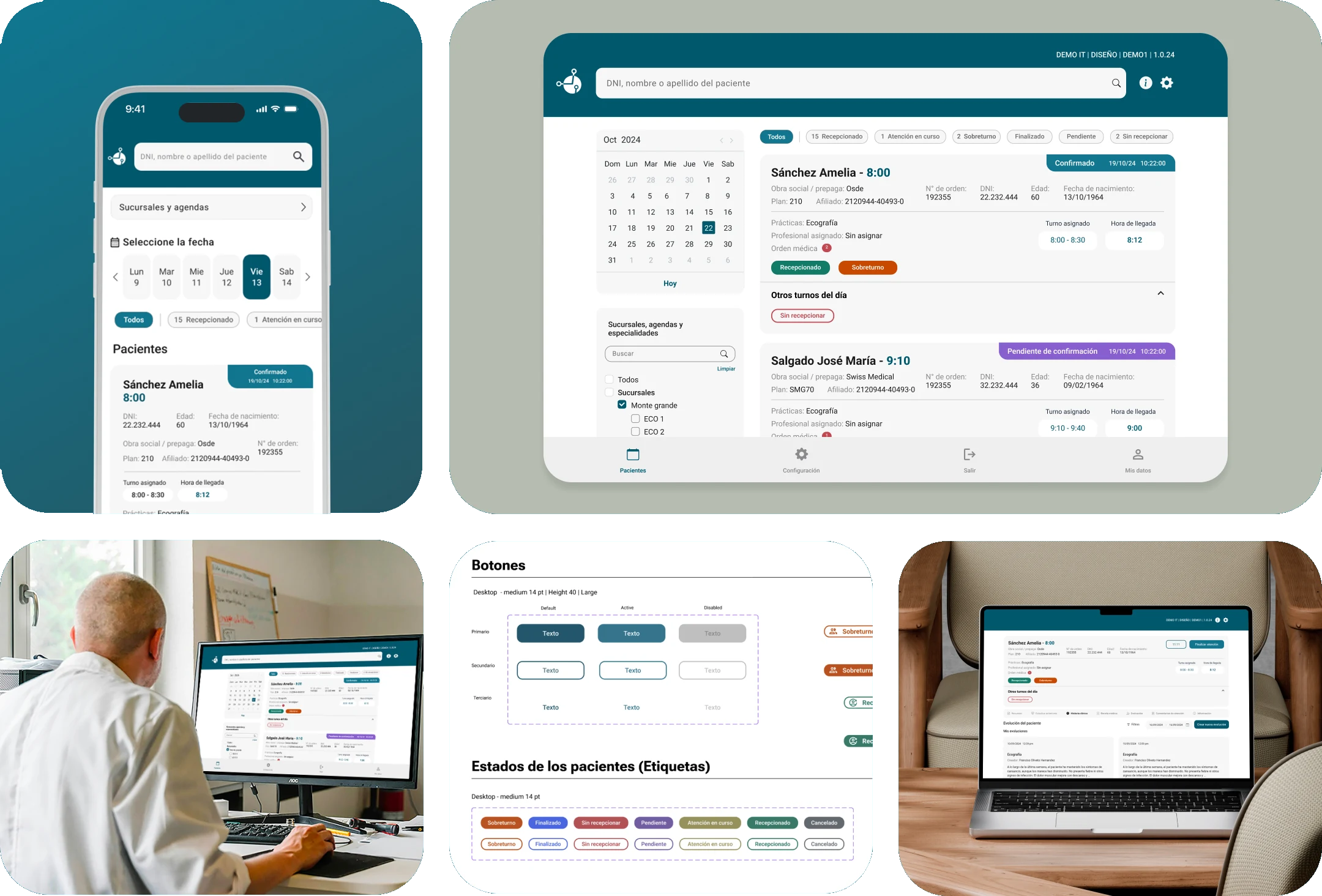
From insights to the final design
An iterative process that started with product discovery and ended in a design system validated with real users.
12 interviews, 4 different profiles
We ran in-depth interviews with the different profiles that use the system every day, to ground each design decision in real data.
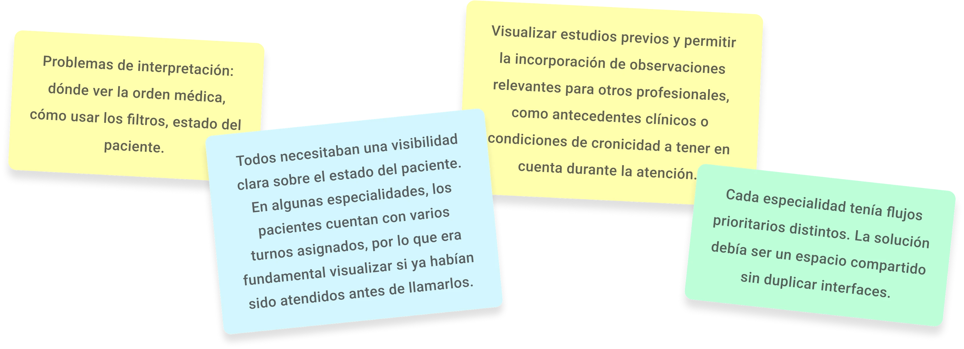
Processing this information was key to grounding every design decision, ensuring a more effective experience aligned with the needs of each profile.
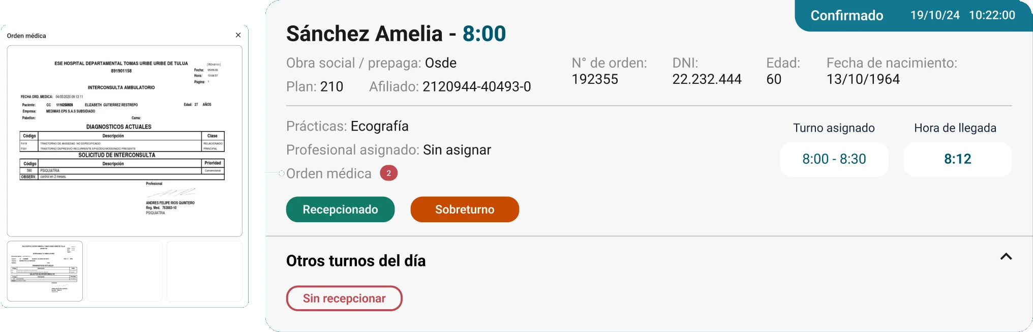
The way patient information is organized was redesigned, establishing a clear visual hierarchy that prioritizes key data. This lets professionals quickly reach the most relevant information and prepare more efficiently before seeing the patient.
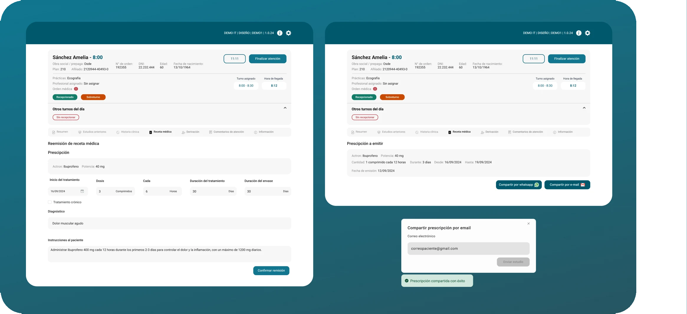
We were also asked to incorporate the Mandatory Digital Order required by the Ministry of Health, replacing handwritten prescriptions and modernizing the medical prescription process.
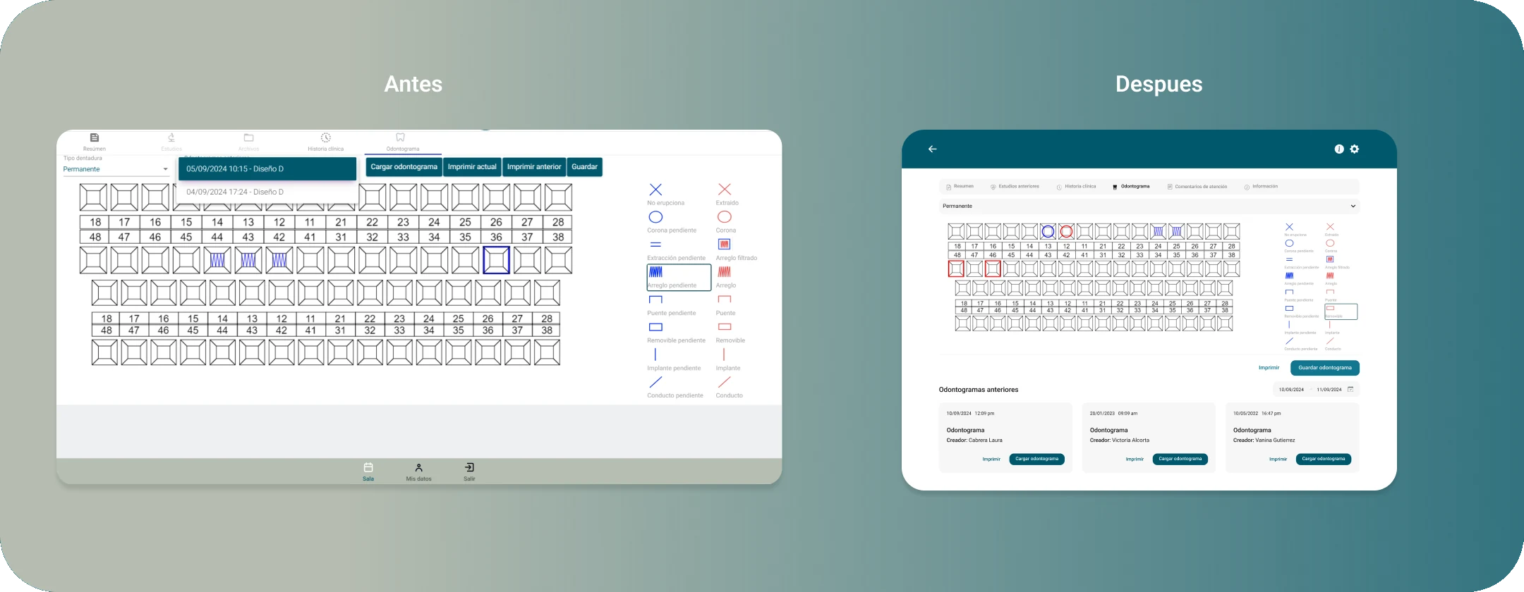
A dedicated dentistry section was designed, including an interactive odontogram and each patient's clinical history, making it easier to follow treatments and reach relevant information.
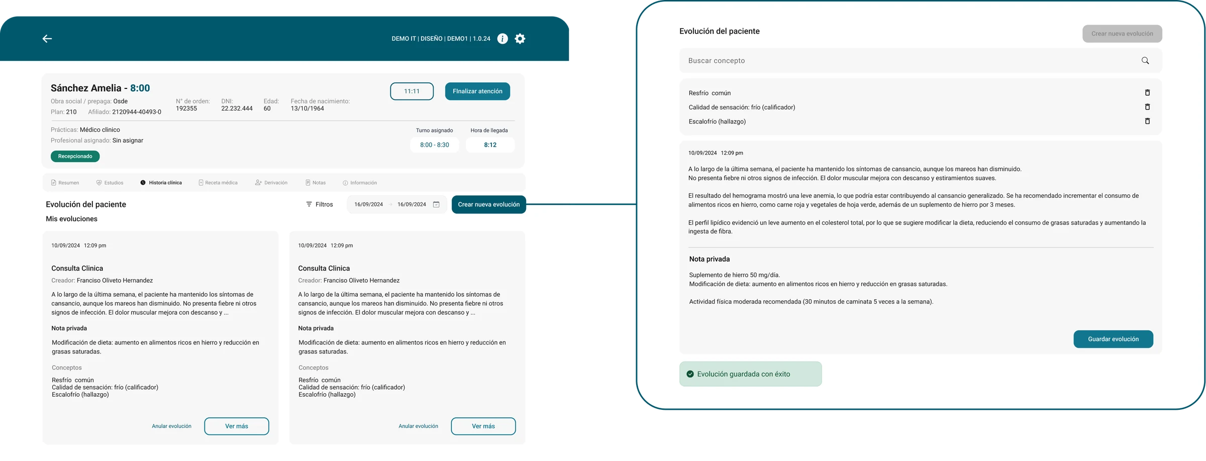
A library of standardized concepts was added to complement medical notes, allowing clinical information to be documented with clear terms that are easy to interpret internationally, making it easier to exchange medical records between professionals in different countries.
Testing
Design
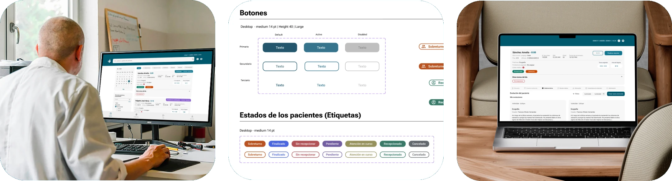
Given the complexity, a scalable design system was built on foundations, reusable components and consistent interaction patterns. This unified the experience, improved collaboration between design and development, and set the groundwork for the product's future evolution.
Designing for a healthcare context with multiple user profiles teaches that informational clarity is not an aesthetic choice — it is functional. A mislabeled status or an ambiguous icon has real consequences for patient care. Research with real users is what made defensible design decisions possible.